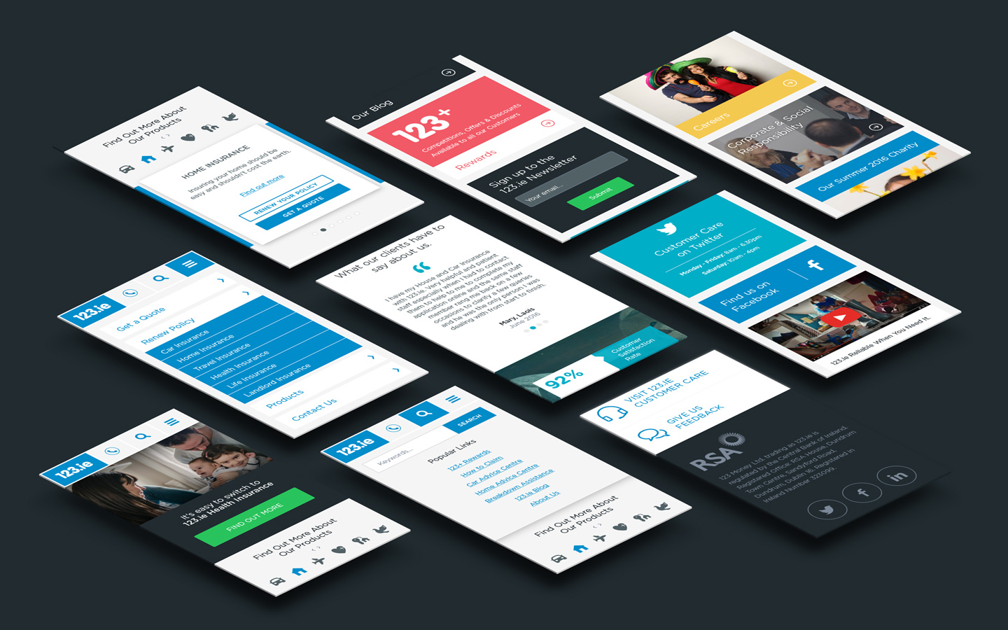
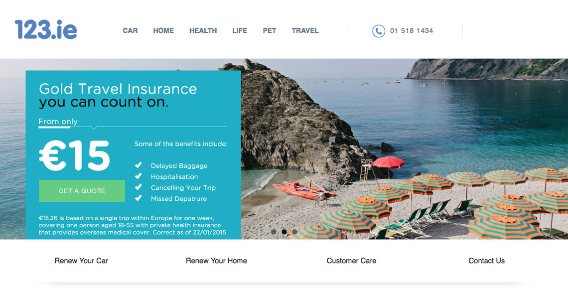
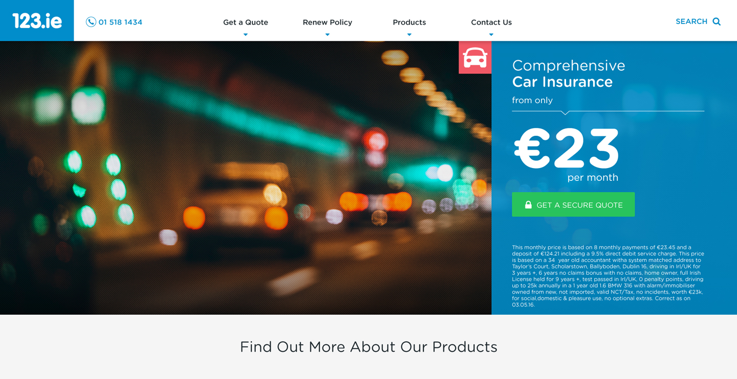
123.ie Homepage
Processes
UX Analysis
Wireframe Sketching
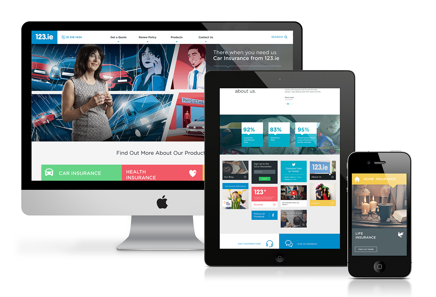
Prototyping
UI Design
Role
Design Lead
UX Direction
Karen Reilly
Frontend Dev
Alexis Bertin
URL
http://www.123.ie/
Year
2016
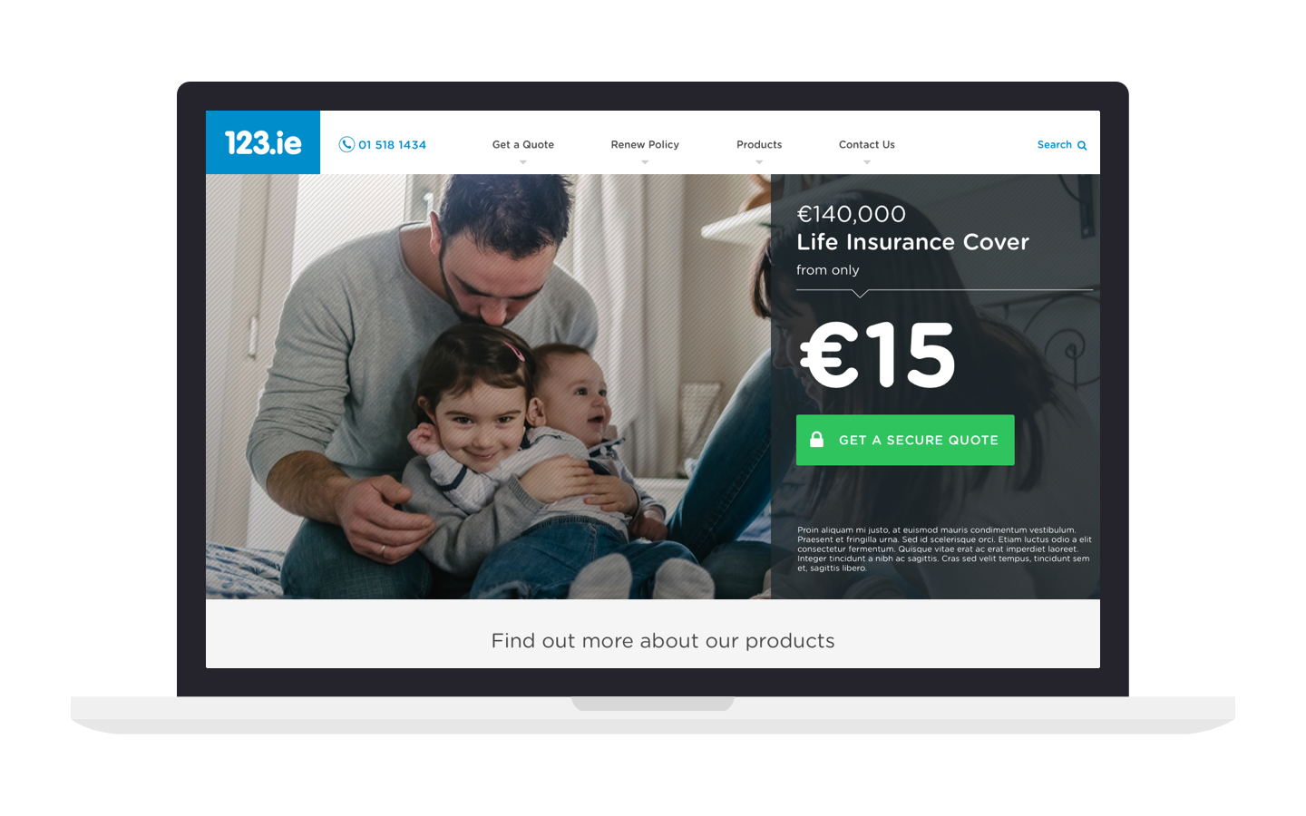
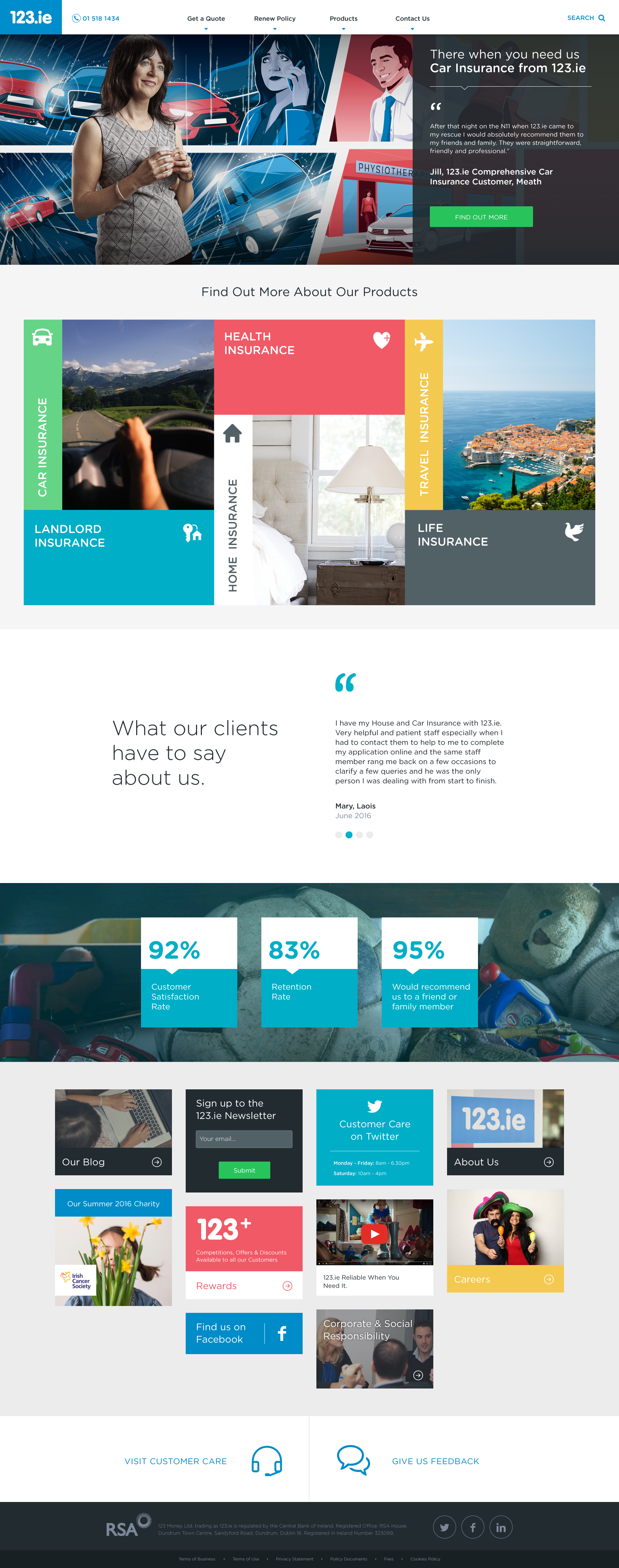
Implementation of the new homepage lead to greater user engagement and increased conversion rates. Comparing the existing theme to the new homepage, there was an increase of 220% for Car Insurance, and a 128% increase for Home Insurance conversion rates.
Challenge
123.ie wanted to drive new and existing business through their website and reduce calls to their call centre. With the need to add and remove different products, the existing design was not flexible enough for them.
A design solution needed to be created that would not only engage users, but also be in development scope of the existing build.
Approach
Driven by research into user behaviour and user profiles, a number of recommendations were made to improve the user experience and visual design of the homepage.
- Analysis of existing website
- Sketching & wireframing
- Visual design & microinteractions
- Design & development scrums
Existing Website: Navigation
It was clear some of the design elements weren’t working. The main navigation only listed the top level product pages and didn’t link directly to either the renew or quote pages, which were the most popular. Heatmaps from Crazy Egg, a data visualisation tool, showed that the secondary links hidden below the graphic banner and were often overlooked.
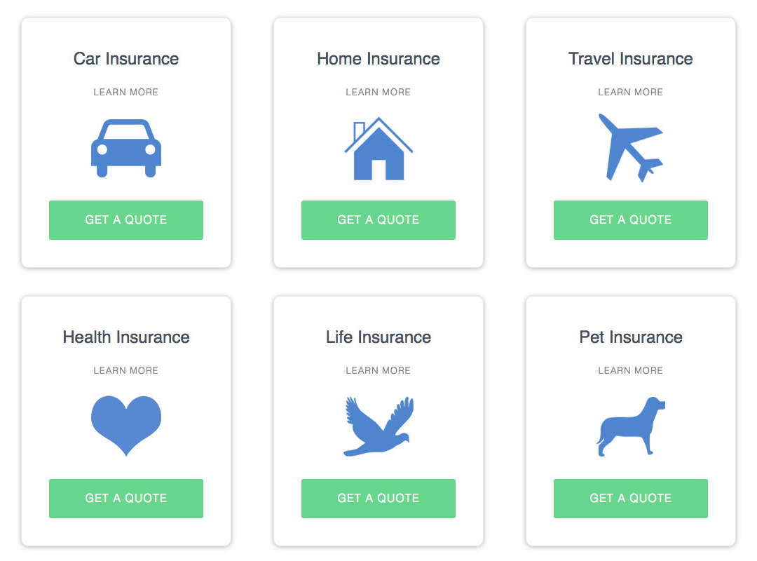
Existing Website: Product Tiles
User testing showed that the main product blocks were causing some confusion. The entire product tile linked to the product overview page, however the primary CTA to quote page was placed within this link. This was not only bad from an accessibility point of view, but was also frustrating users.
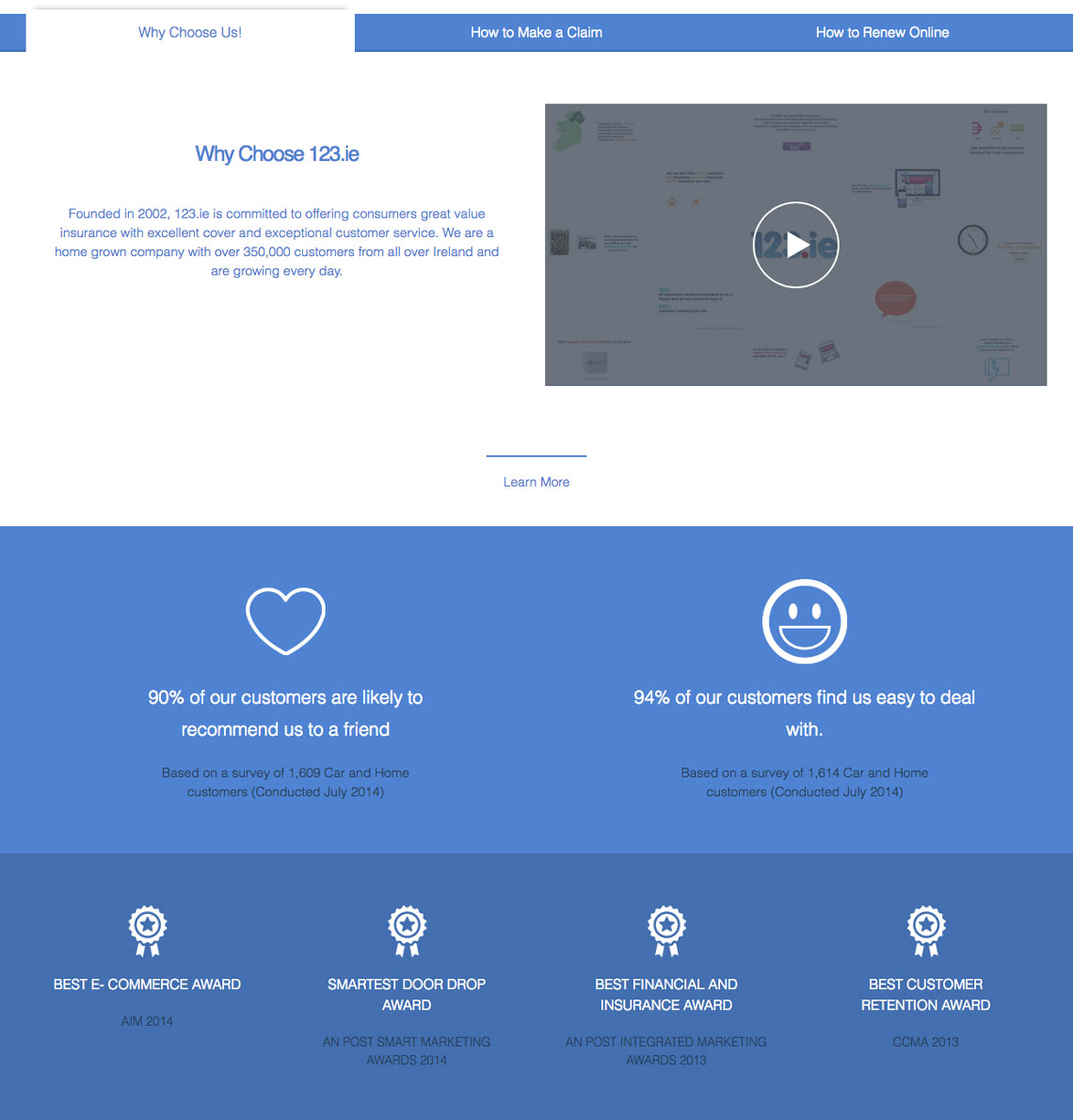
Existing Website: Content Tabs
There was a lack of imagery on the page as a whole. Icons were used for products and for brand reinforcement elements. However, with the repetitive use of the brand blue, the site felt monotonous and uninspiring. Important information on how to make claims and renew online were also hidden behind tabs, and had very low engagement.
Sketching & Wireframing
Sketches and wireframes were created and ideas discussed with the user experience, design and development team members, before being presented to the client. User journeys, microinteractions and the technical feasibility were considered and explored.
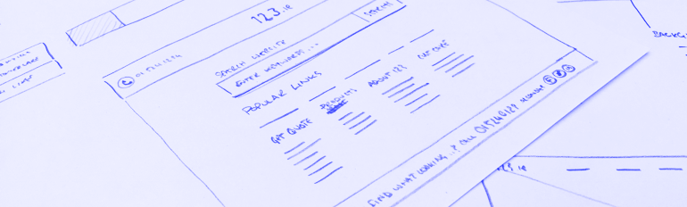
Navigation restructure would mean users would have immediate access to renew policies, get a quote for any insurance policy. Contact information for claims or breakdown assistance could be directly accessed from anywhere on the site.
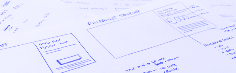
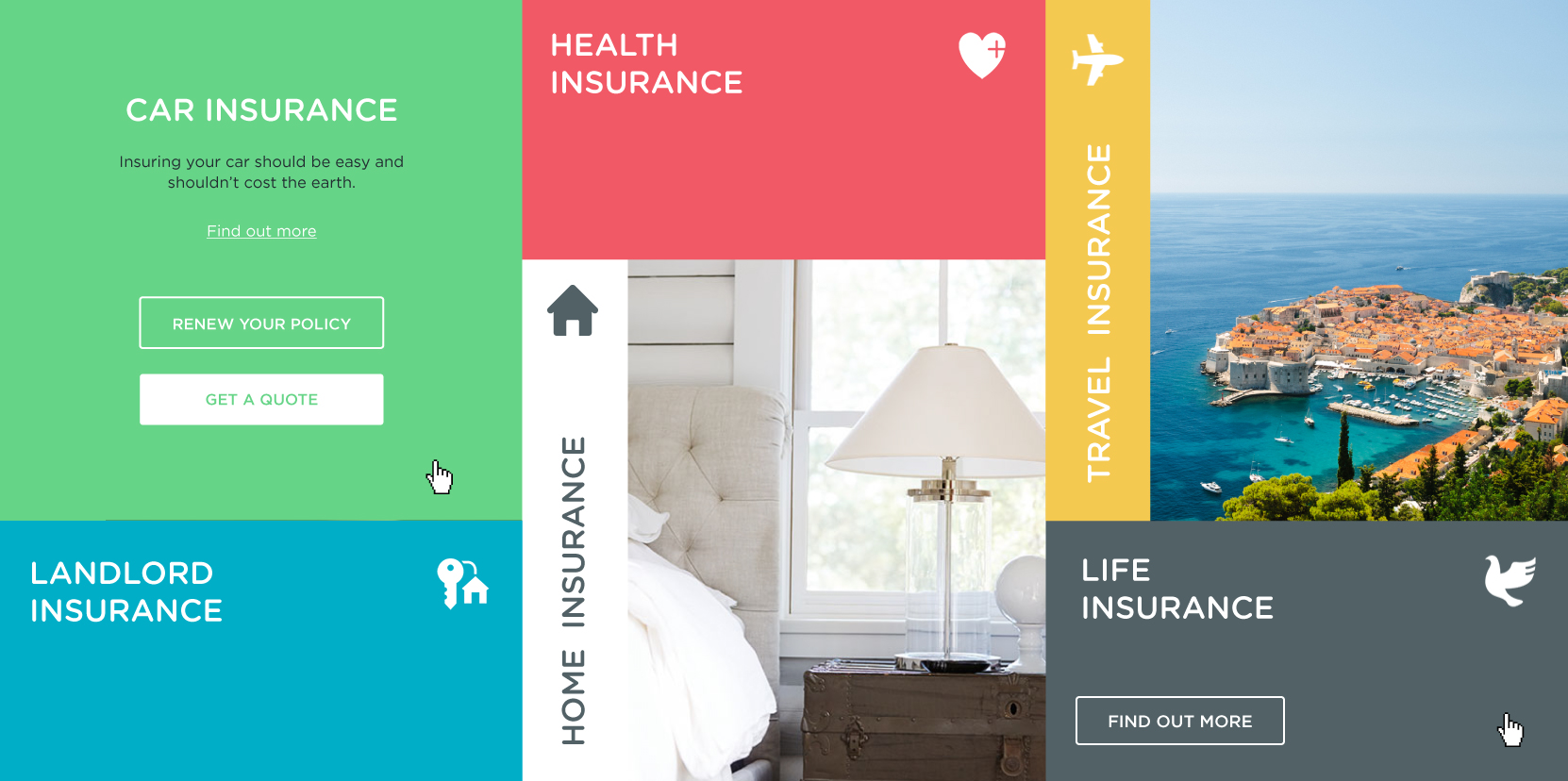
Requirements for 3 product promotion templates for the graphic header were identified and defined while working closely with the client. They needed to have enough flexibility for the different types of promotions as well as being adaptable within the responsive framework.
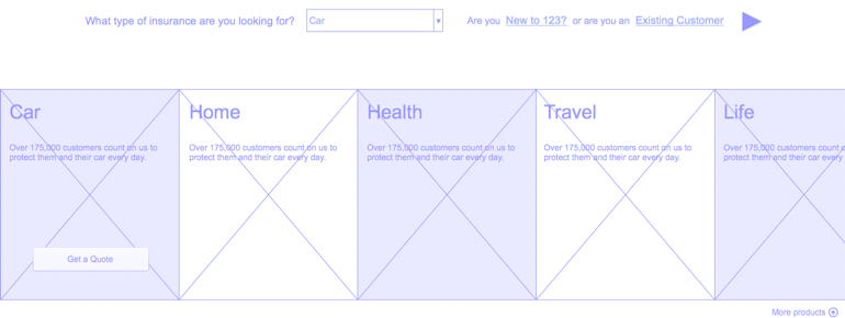
Above is the wireframe of the original proposal for a real-time interactive carousel product listing. Although providing flexibility, this wasn't great for the client as it would mean some products would be hidden by default. Interating on this idea, I proposed a full-width grid of products. These would have more of a masonary feel to them, yet still give the flexibility required.
Visual Design & Microinteractions
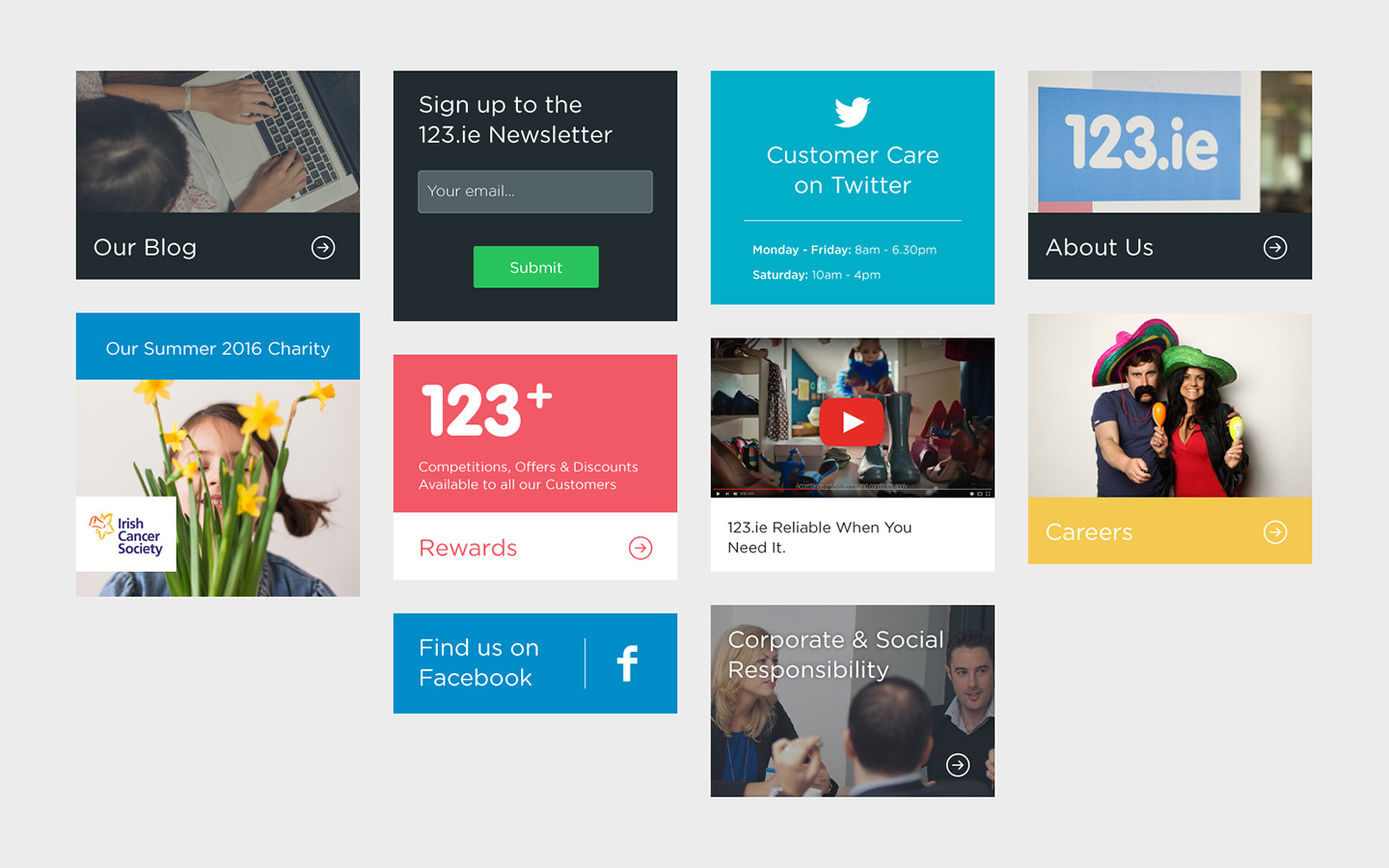
Visual concepts went through a number of iterations before arriving at a solution that everyone was happy with. More imagery was used, and a larger colour palette was introduced.
Microinteractions played an important role in making the experience more enjoyable and engaging for users. Working closely with the frontend developer during daily scrums, I was able to provide guidance on this.
Design & Development Scrums
After the visual design had been completed the team met to plan the build. We used estimation cards to discuss how the more experimental interactions would come together. The client had a unique deployment process and this needed to be factored in to the build plan.
Once planned and moved into the development stage there were regular scrum meetings to discuss progress, view work in progress and flag potential blockers.

Selected Works
Responsive Web AppCase Study · 2020
AerClub ProfileCase Study · 2020
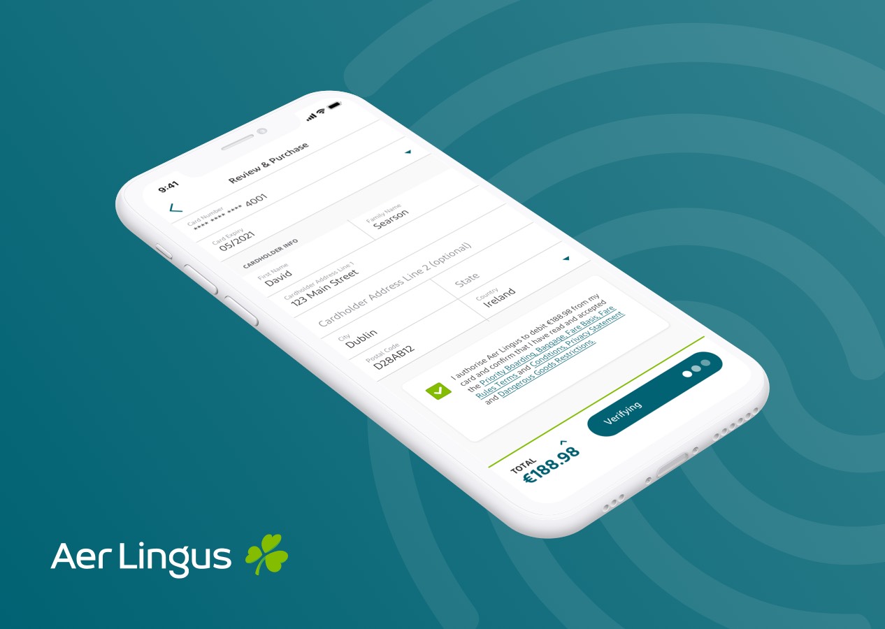
3D Secure PaymentsCase Study · 2019
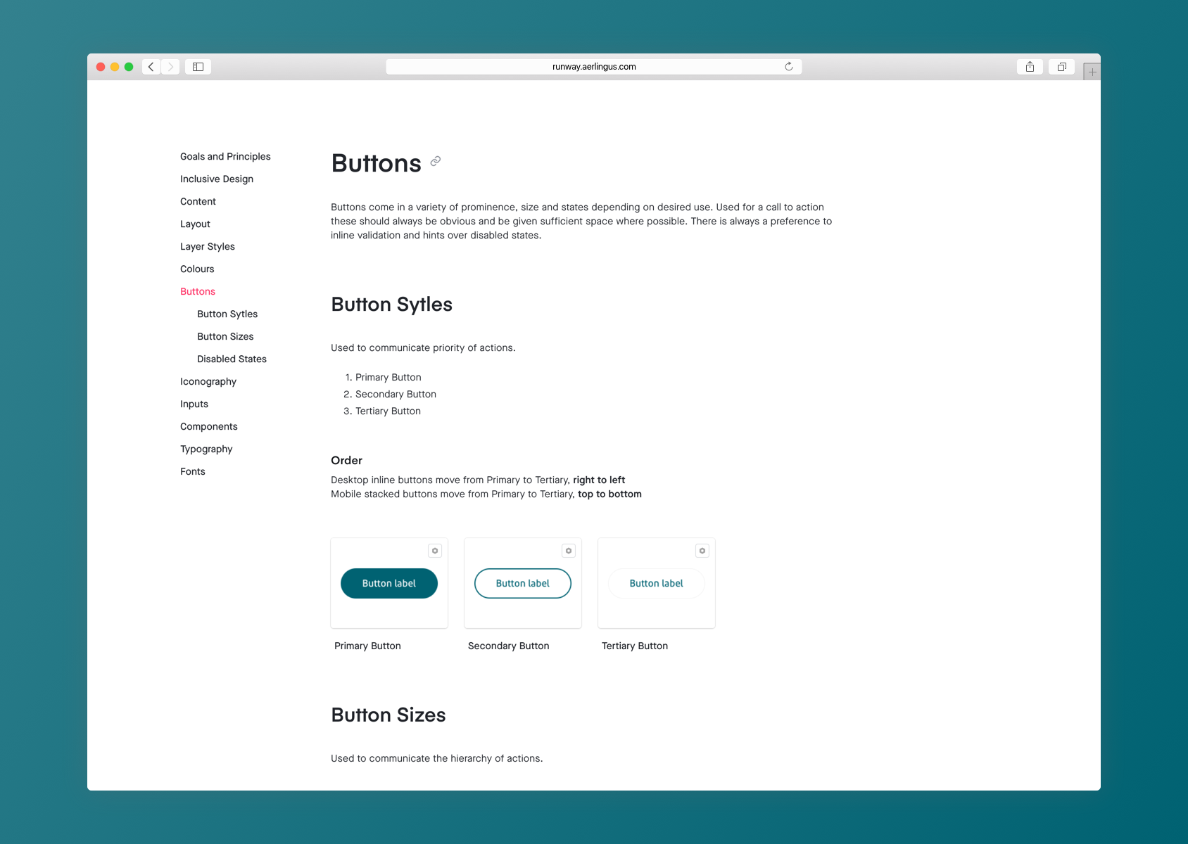
Runway Design SystemCase Study · 2019
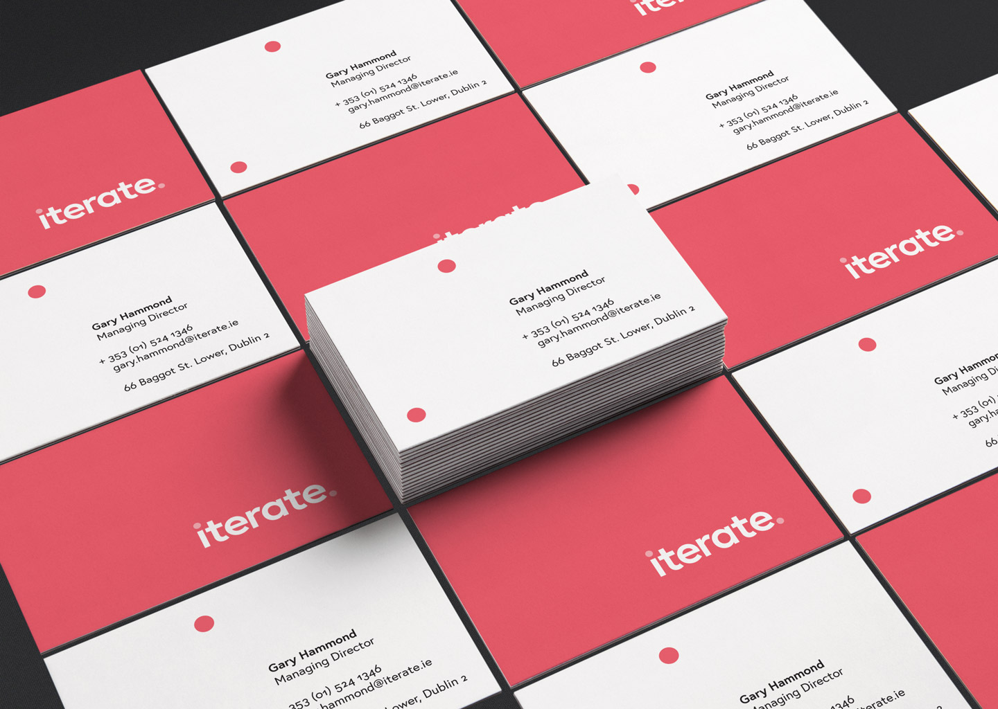
Iterate Branding & IdentityCase Study · 2018
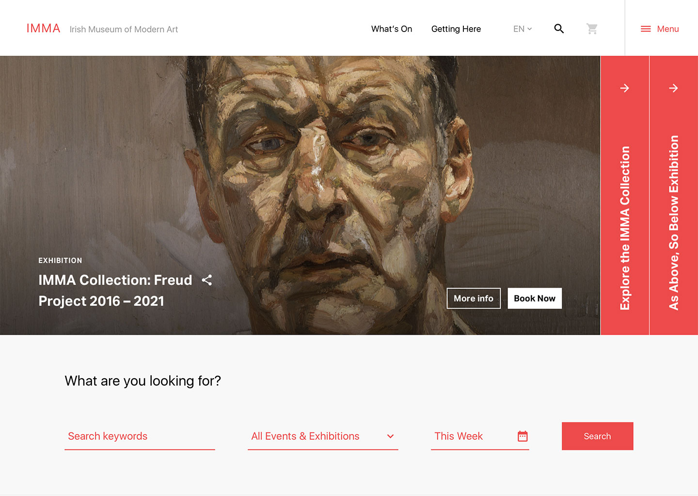
IMMA ConceptCase Study · 2017
Motor Insurance Quote JourneyCase Study · 2016