Irish Museum of
Modern Art
Processes
Design Research
Information Architecture
Wireframe Sketching
UI Design
Role
Design Lead
UX Direction
Karen Reilly
URL
http://www.imma.ie/
Year
2017
IMMA connects audiences and art, providing an extraordinary space in Ireland where contemporary life and contemporary art connect, challenge and inspire one another.
Challenge
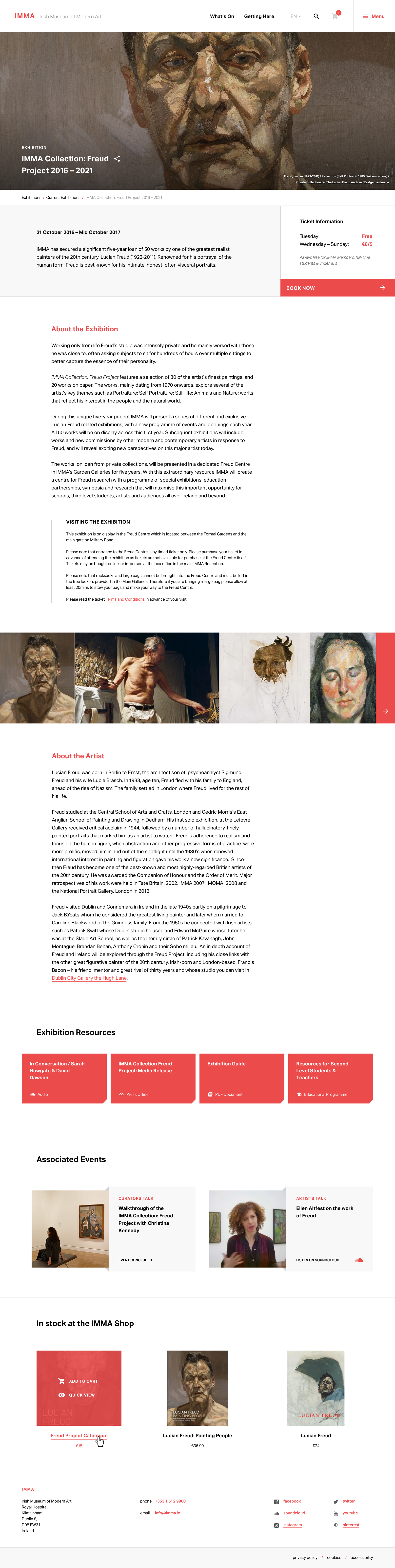
The museum had a badly outdated website which needed modernising. There was a call for submissions to re-imagine the online offering to patrons to communicate the breadth of what’s on offer at IMMA.
The site needed to include information on current exhibitions including a checkout system for purchasing tickets, full integration with their ecommerce gift shop, information on upcoming events, venue hire, and integration with their digital collection.
Approach
After reviewing the brief a number of times the requirements were listed and prioritised. These requirements served as the basis for the research and were revisited throughout the design process to ensure all needs were being both met and challenged. The following approach was taken for the design:
- Review of existing site
- Digital context
- Physical context
- Card sorting & sketching
- Visual design
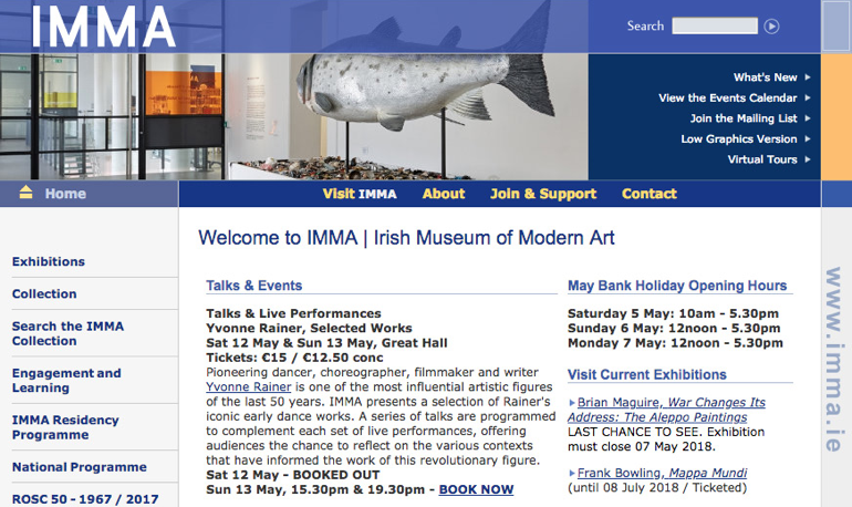
Existing Website
It was clear that big improvements would be necessary to improve the experience for site vistors. The site was confusing to navigate with some links taking users outside of the website to search external databases.
There was an overwhelming amount of content packed into each page making it difficult to digest content. The website was not responsive making it unsuitable for viewing on mobile devices.
Placing the Museum in Context
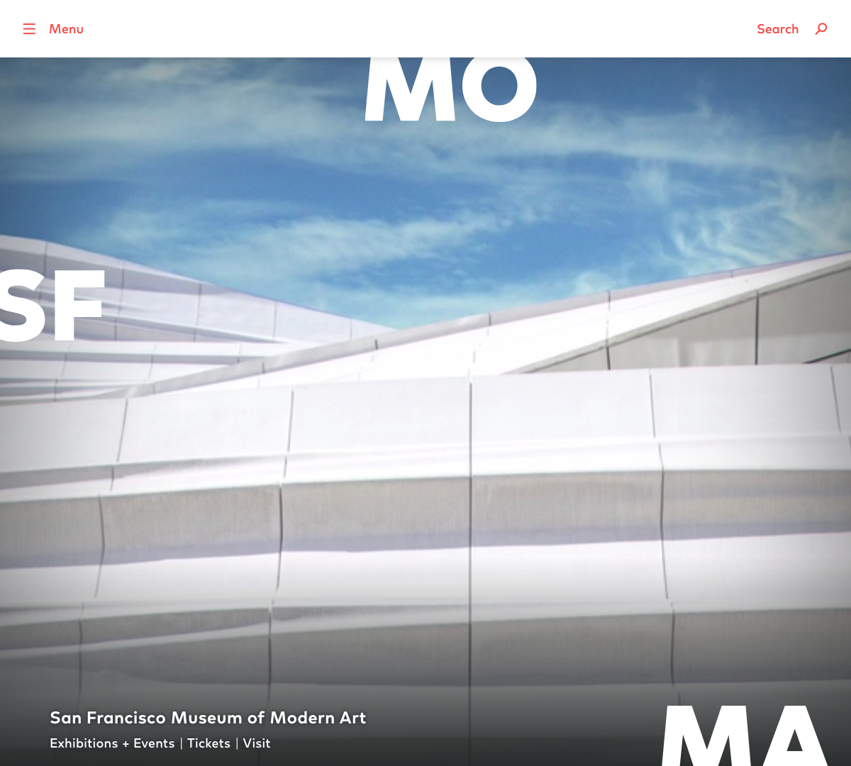
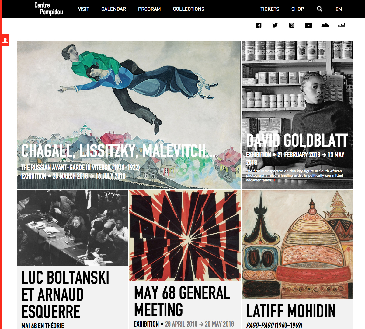
Patterns were identified from researching other art institutions. There was a greater emphasis on imagery. This was evident on the Centre Pompidou and Museum of Contemporay Art Los Angeles websites.
Clean typographic treatment and simplified navigation focusing on current exhibitions was another trend. This was probably best demonstrated by SFMoMA.
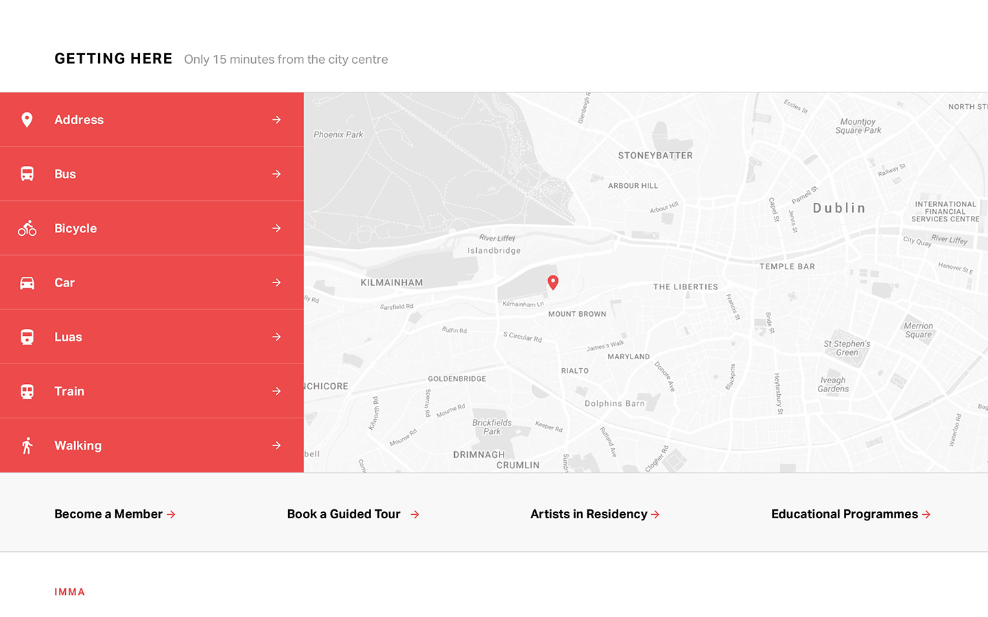
There was also a focus on planning museum visits with information on locations, tickets and transport which could be seen on the Tate Modern and Arnolfini websites.
Visiting the Museum
The museum is situated within the grounds of the Royal Hospital at Kilmainham with it’s impressive courtyard, beautiful landscaped gardens, and converted stables which host the artists in residence studios.
Inside the exhibition space artworks are exhibited in the long naturally lit corridors of the main building with smaller spaces dotted along the length of these corridors. This is quite unique in comparison to most modern art galleries and creates a very initimate experience for the viewers. In order to link the physical space with the website an ‘Experience IMMA’ section was proposed.
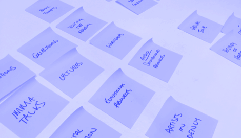
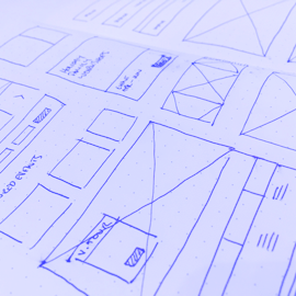
Card Sorting, Personas and Sketching
The museum gets visitors of all ages with varying levels of abilities. Both seasoned museum goers and once-off visitors new to Dublin city needed to be accomodated in the design.
Along with these users, students looking for resources or those interested in upcoming events such as the IMMA Talks series also needed to be considered.
Content was organised by placing headings on post-its and grouping, re-grouping and prioritising. Sketching wireframes then allowed for quick iterations on design ideas.
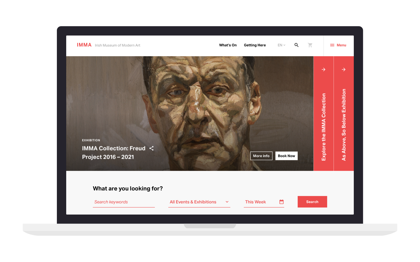
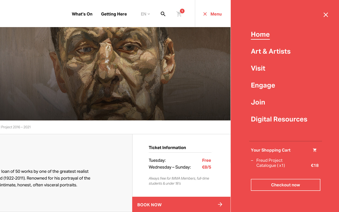
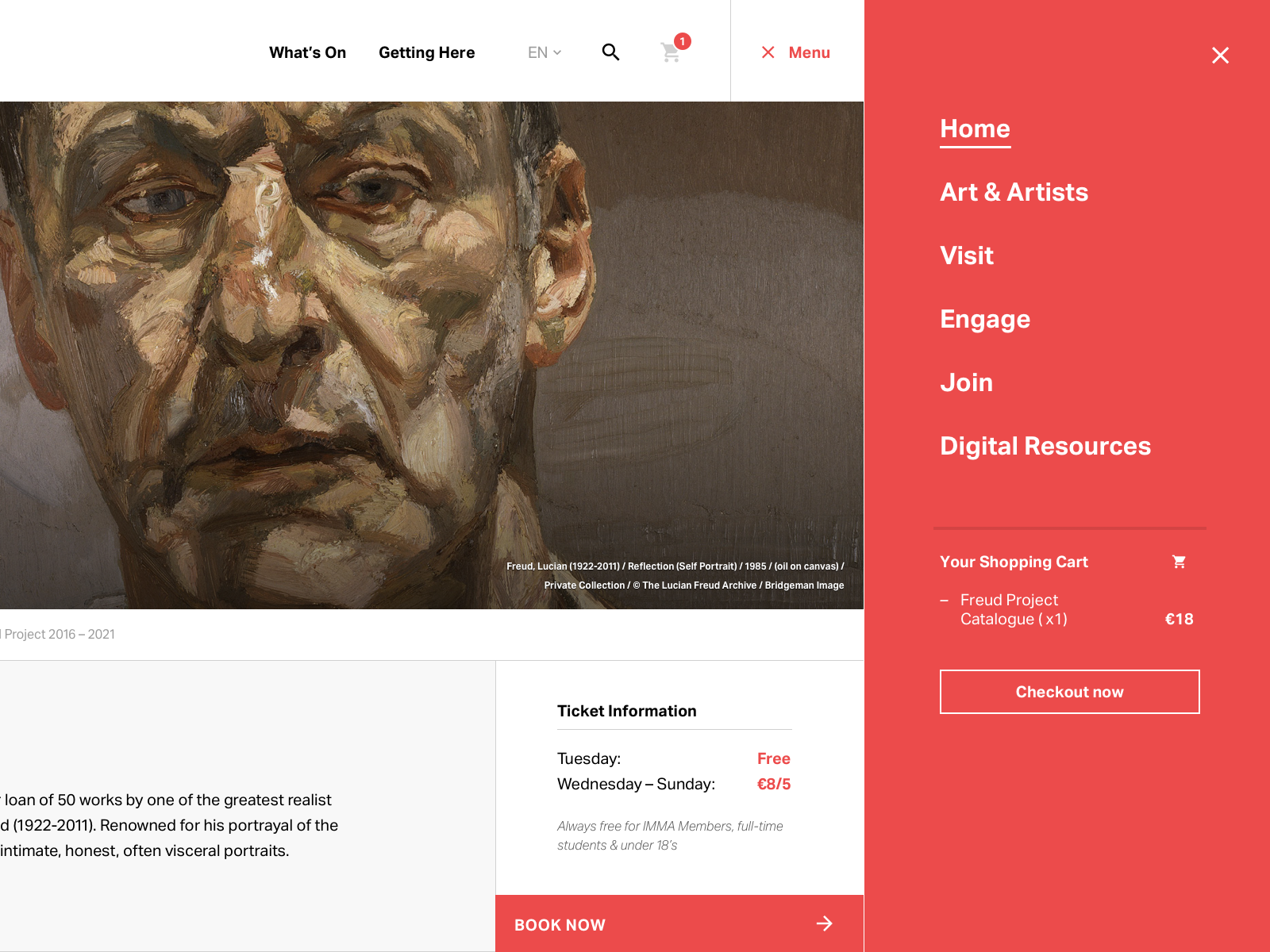
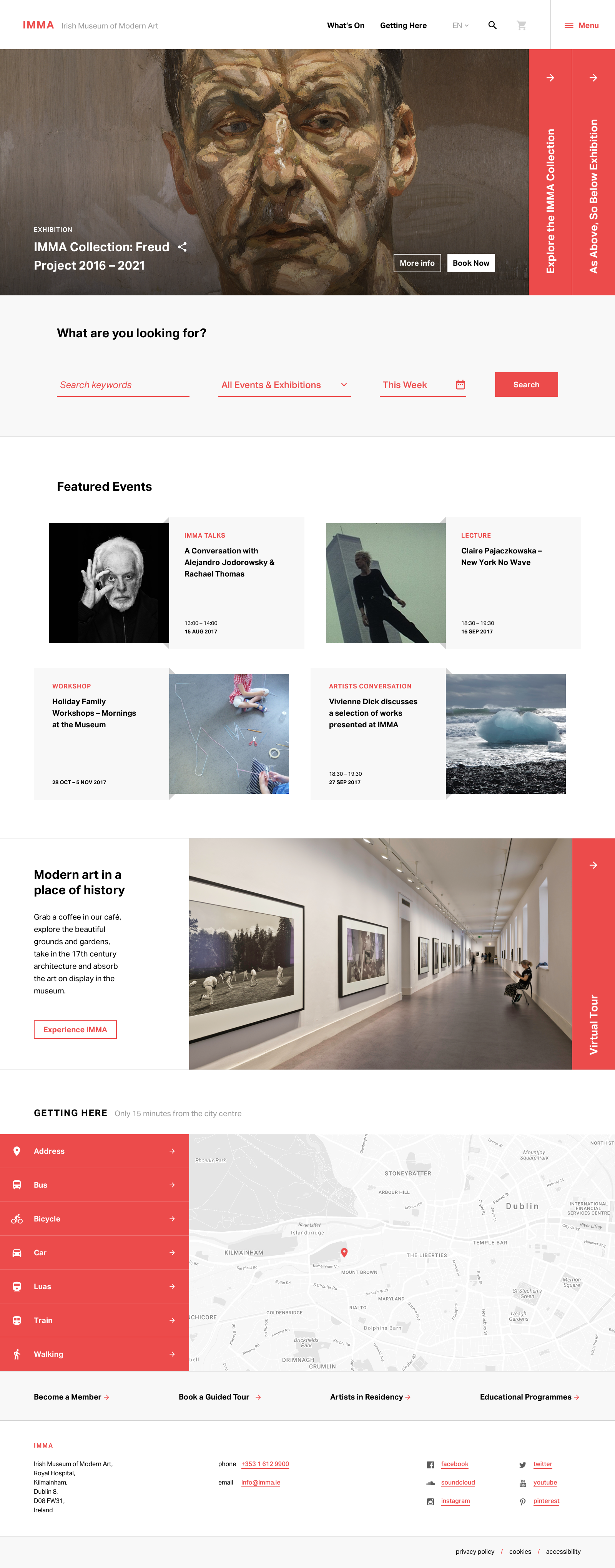
Design Outcomes: Navigation
Navigation was simplified prioritising What’s On and Getting Here. A large site search was placed underneath the featured exhibition section allowing for self guided navigation and planning future visits to the museum.
Related resources, events and gift shop items could be tagged against exhibitions and these would display on content pages. The ecommerce cart was incorporated into the menu allowing for quick checkout.
Design Outcomes: Typography & Colour Palettes
It was important to maintain a clean interface that wouldn’t detract from artworks or information heavy content. A minimal colour palette was used and whitespace also played it’s role in framing the content.
Typographic treatments favoured a grotesque sans-serif opting for Acumin Pro over NB Grotesk which was being used for wayfinding and other promotional materials. This ensured maximum legibility for large paragraphs of body copy.
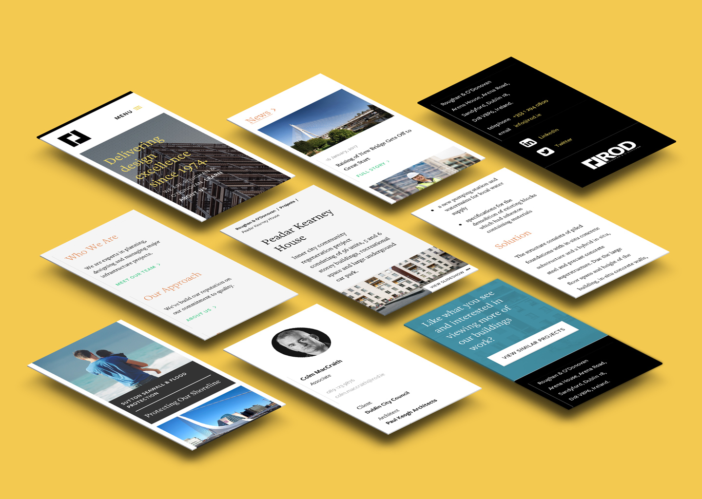
Selected Works
Responsive Web AppCase Study · 2020
AerClub ProfileCase Study · 2020
3D Secure PaymentsCase Study · 2019
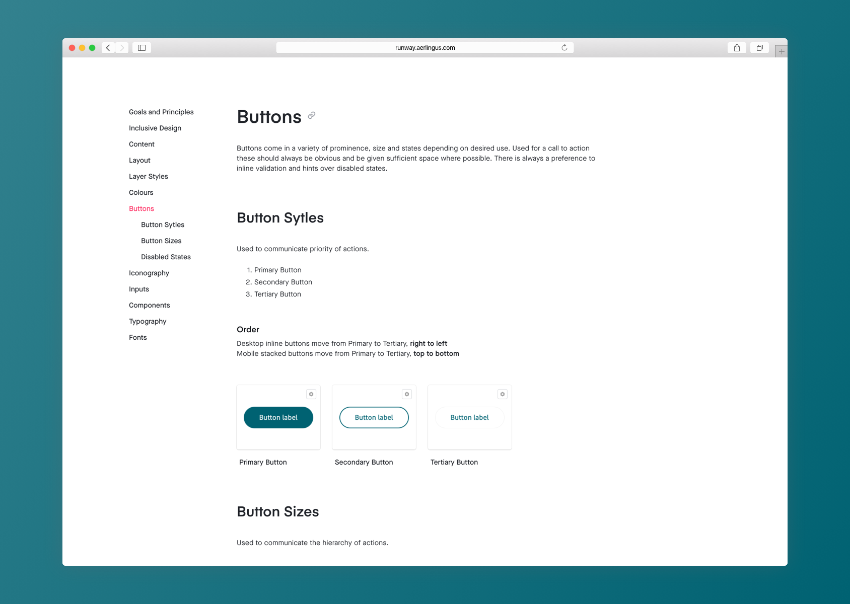
Runway Design SystemCase Study · 2019
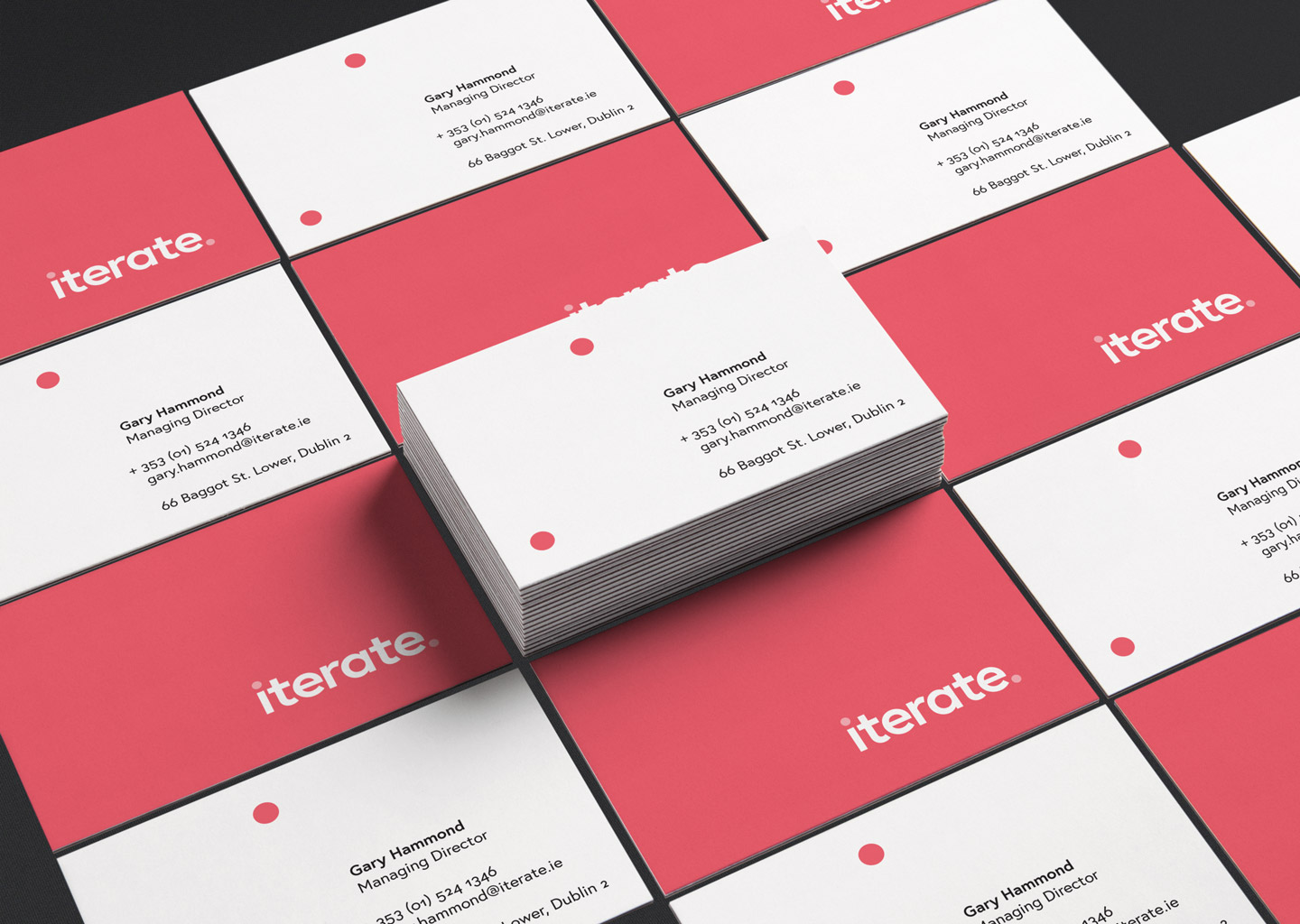
Iterate Branding & IdentityCase Study · 2018
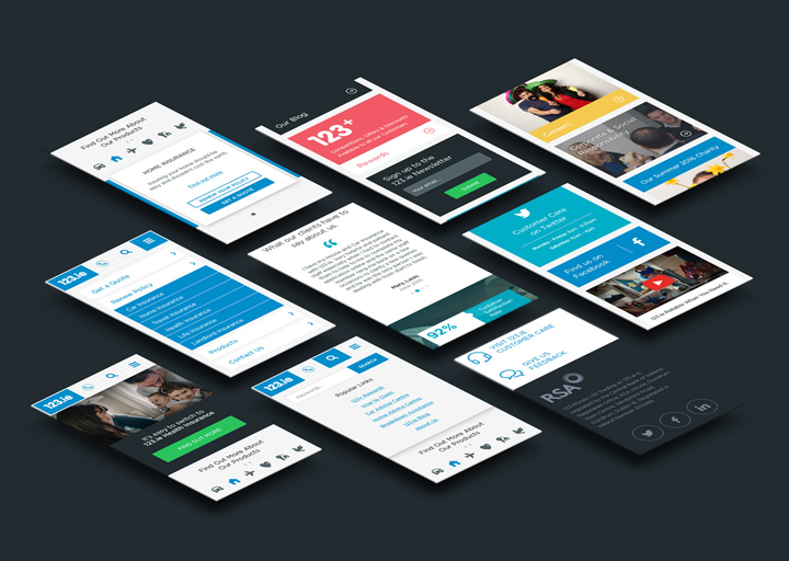
123.ieCase Study · 2016

Motor Insurance Quote JourneyCase Study · 2016