Iterate Branding &
Identity
Processes
Brand Analysis
Discovery Workshop
Brand Design
Identity Guidelines
Role
Design Lead
Year
2018
Iterate needed a more cohesive identity that better reflected their core values and work. I led both the design research and discovery workshop which brought the whole team together, before designing the brand. This resulted in arriving at a solution which everyone contributed to, allowing for a shared ownership of the company identity.
Challenge
A brand is not just a logo or a good looking website. It’s something that should reflect the company’s core values. Every team member should be a brand ambassador and understand what the company represents. This should be communicated to the public and clients alike. In his book The Brand Gap, brand strategist Marty Neumeier states, "a brand is not what you say it is, it’s what they say it is".
Approach
Along with the company directors I outlined the project objectives. After the initial research and workshop, the work was approached in design sprints, with regular feedback and involvement of the whole team.
Discovery
Team workshop
Workshop outcomes & proposal
Logo, typography, colour treatments
Brand & identity guidelines
Discovery
Before approaching any visual design work I needed to inform the team about branding. In doing this I was able to convince the directors of the importance of refining the company brand & identity.
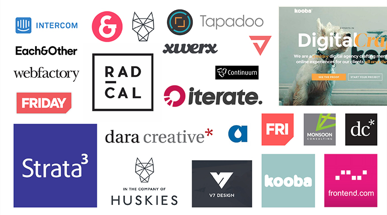
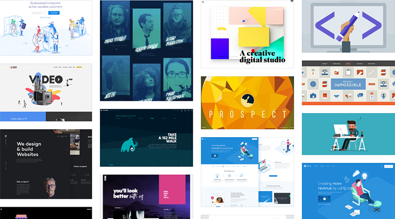
Looking at how the brand had evoloved over the years I took examples of all the current implementations of the brand and highlighted inconsistencies. Touchpoints included the company website, project proposals, research reports, conference presentations, invoicing and support contracts.
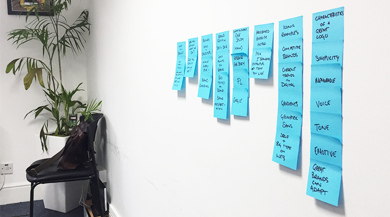
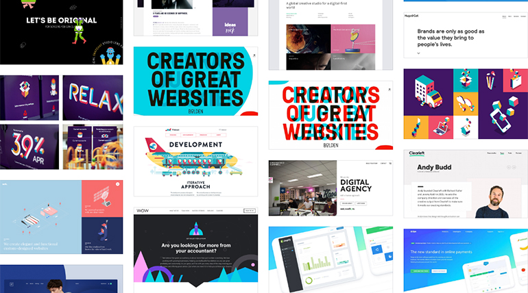
We looked at what makes a successful brand. Taking a few examples of recent well known rebrands—Mastercard, Google and F1—we discussed some of the changes that were made. What did the existing brand fail to communicate? Did it look dated? Had the company shifted its positioning? Did the team think the rebrand was successful?
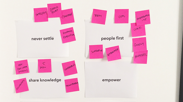
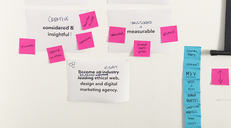
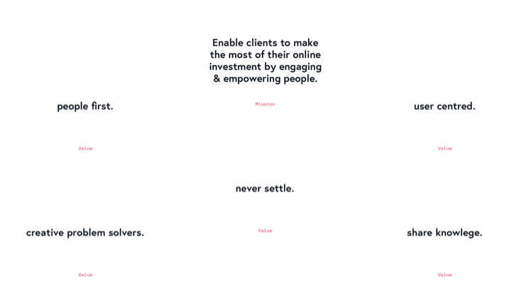
Some previous work on the company mission, vision and core values were revisited. Based on the company’s current brand implementation, was it clear to existing and potential customers of iterate’s identity?
Along with the directors I developed the key business objectives of involvement, longevity, measurability, flexibility and consistency. These would act as a benchmark to measure the success of the project going forward.
Team Workshop
A discussion around the core identity and values would form the basis of design decisions. This was consistently revisited throught the design process to keep focus.
The workshop was carefully designed to ensure team participation. The company directors, business development manager, UX researcher, support manager and development lead would all be taking part so it was important they had some understanding of design.
We began by trying to understand what the company name meant to each member of the team. The team placed words around the existing logo on the whiteboard. This facilitated a discussion around the company name and how appropriated it was to our work.
Ahead of the workshop the team were asked to collect a number of examples of design they loved and loathed and place it in a shared moodboard in InVision. We identified and discussed common themes and developed a visual vocabulary that we could share.
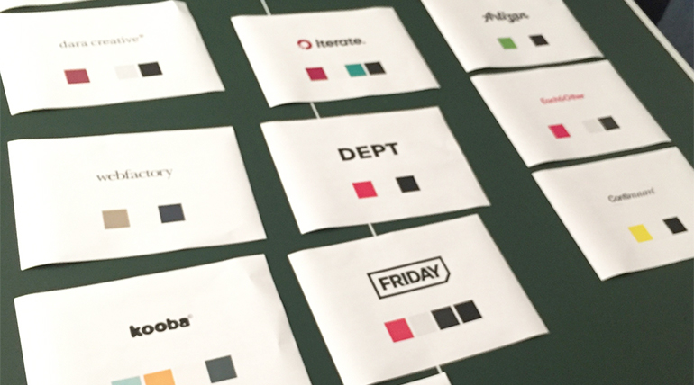
Branding elements of previously selected competitors were printed out. The team grouped these by how they felt the companies were positioning themselves and discussed design elements of their brands. What colours and typography treatments did they use? What was their messaging—professional and clear, or perhaps freindly and approachable? Where did Iterate fit into the mix?

Workshop Outcomes
Collaborating in the workshop allowed us to update and refine our core values, expand on project objectives and agree on a general direction.
Design Process
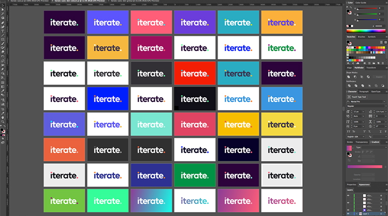
Each design iteration had to reflect simplicity, transparency and approachability. These characteristics informed typography and colour palettes. At the end of each sprint outcomes were presented to the team and proposal for the next steps were outlined.
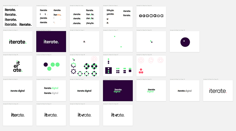
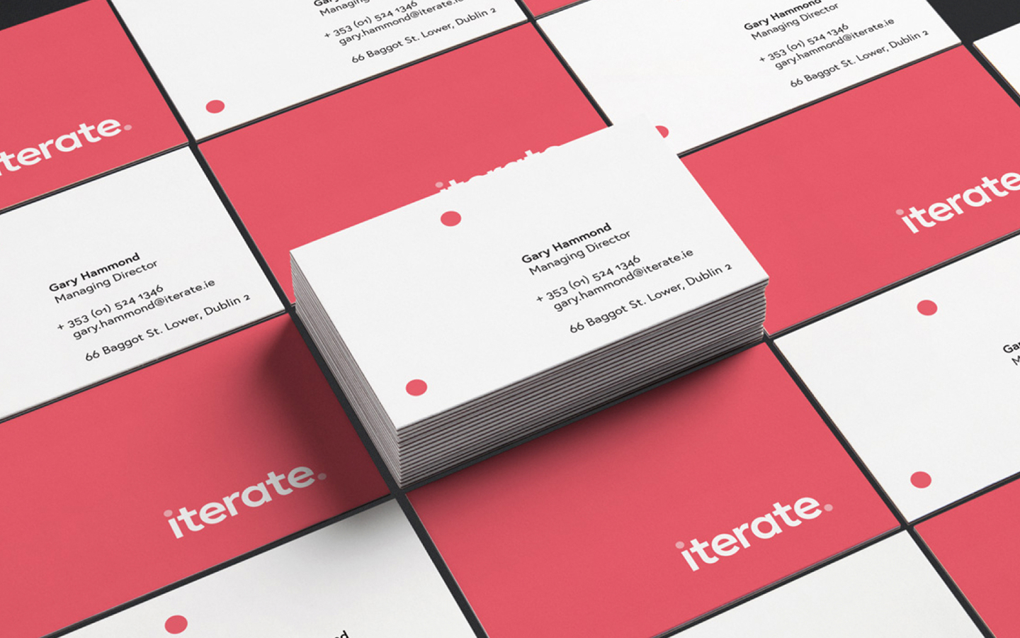
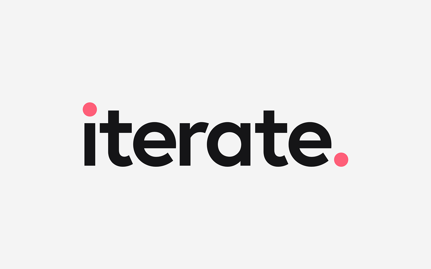
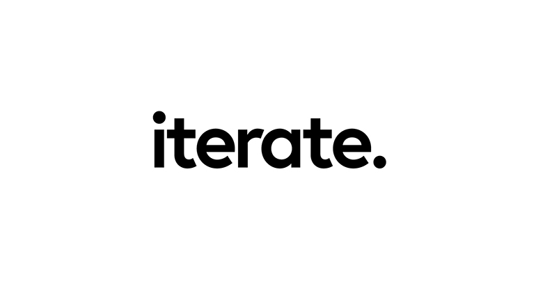
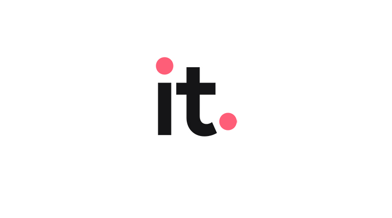
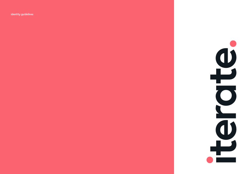
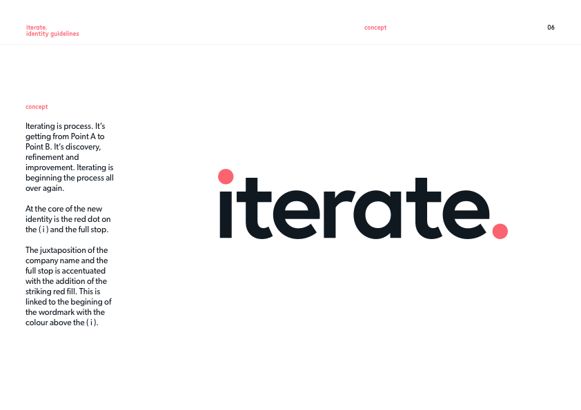
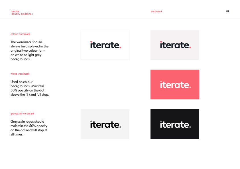
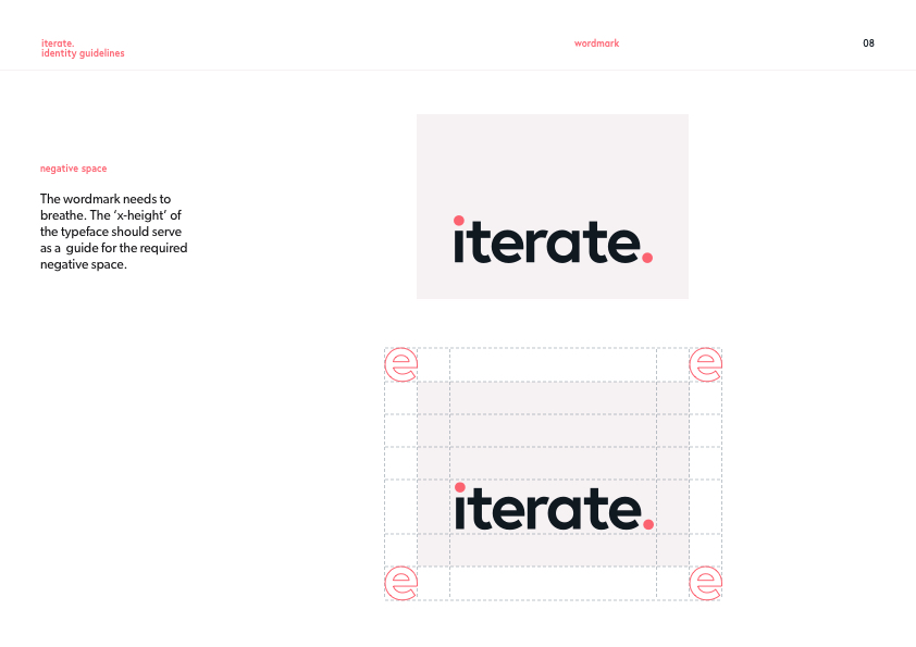
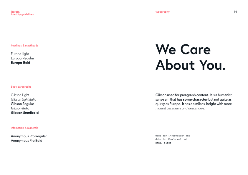
Wordmark
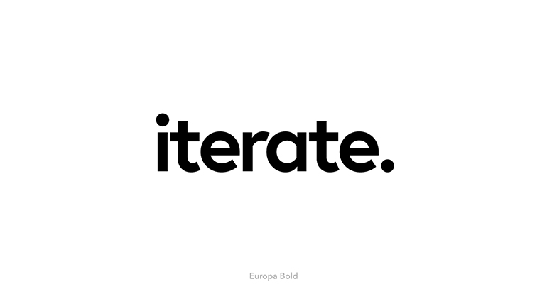
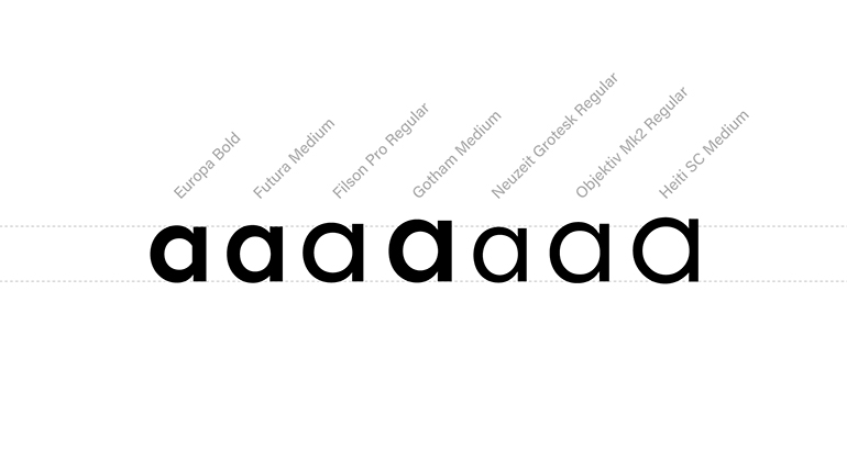
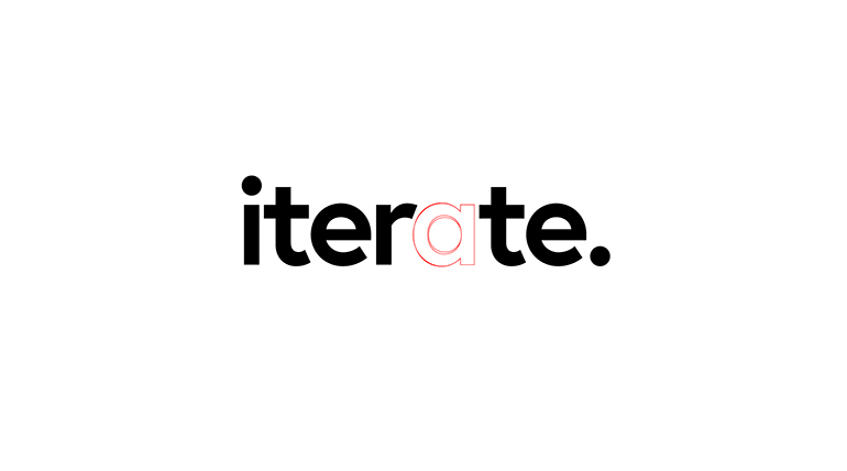
The option to go for a geometric sans-serif best represented the company's values and the chracteristics that we wanted to communicate. The final type treatment used Europa Bold. The tricky interaction between the 'r' and 'a' sat well however there was a unusual straight edge to the counter on the alternate 'a'. This was modified to resemble something inbetween the Europa alternate and Futura 'a'.
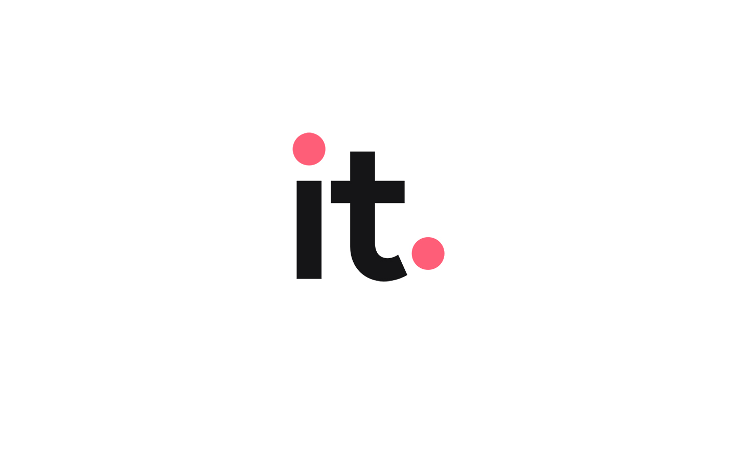
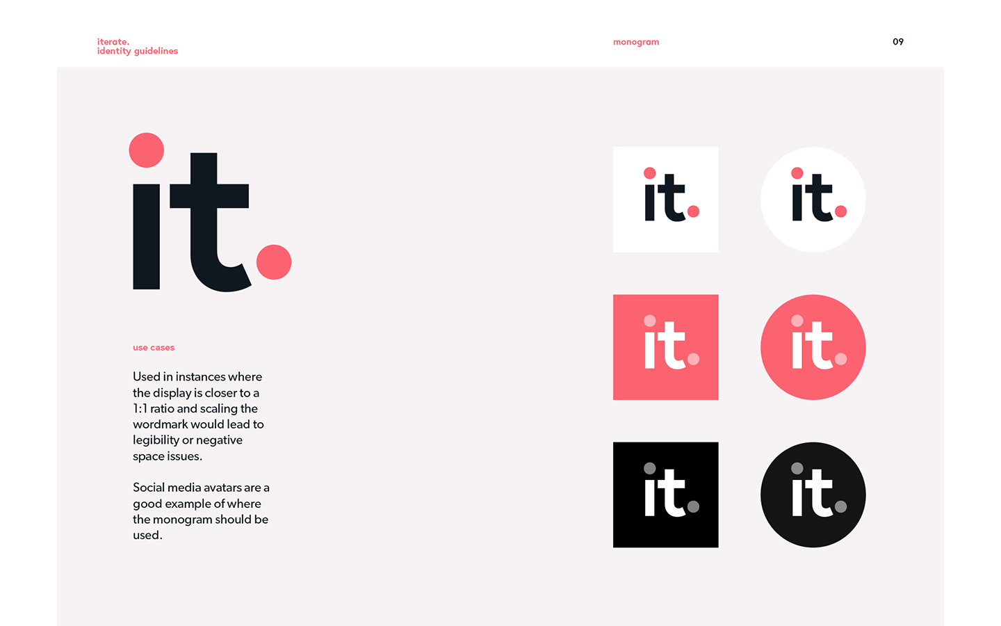
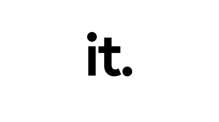
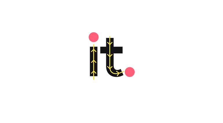
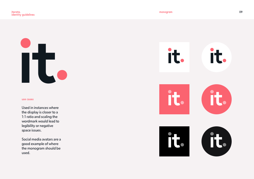
Monogram
Due to the proportions of the wordmark a monogram was designed so that it could be used for profiles on social media. Introducing some motion to the monogram could create a sense of playfulness in digital applications.

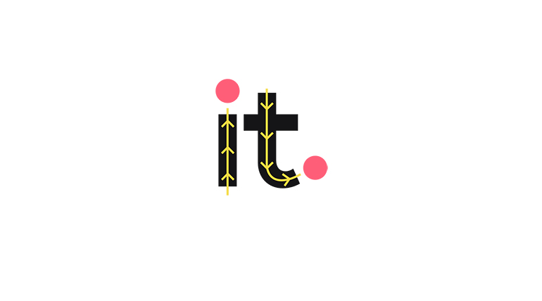
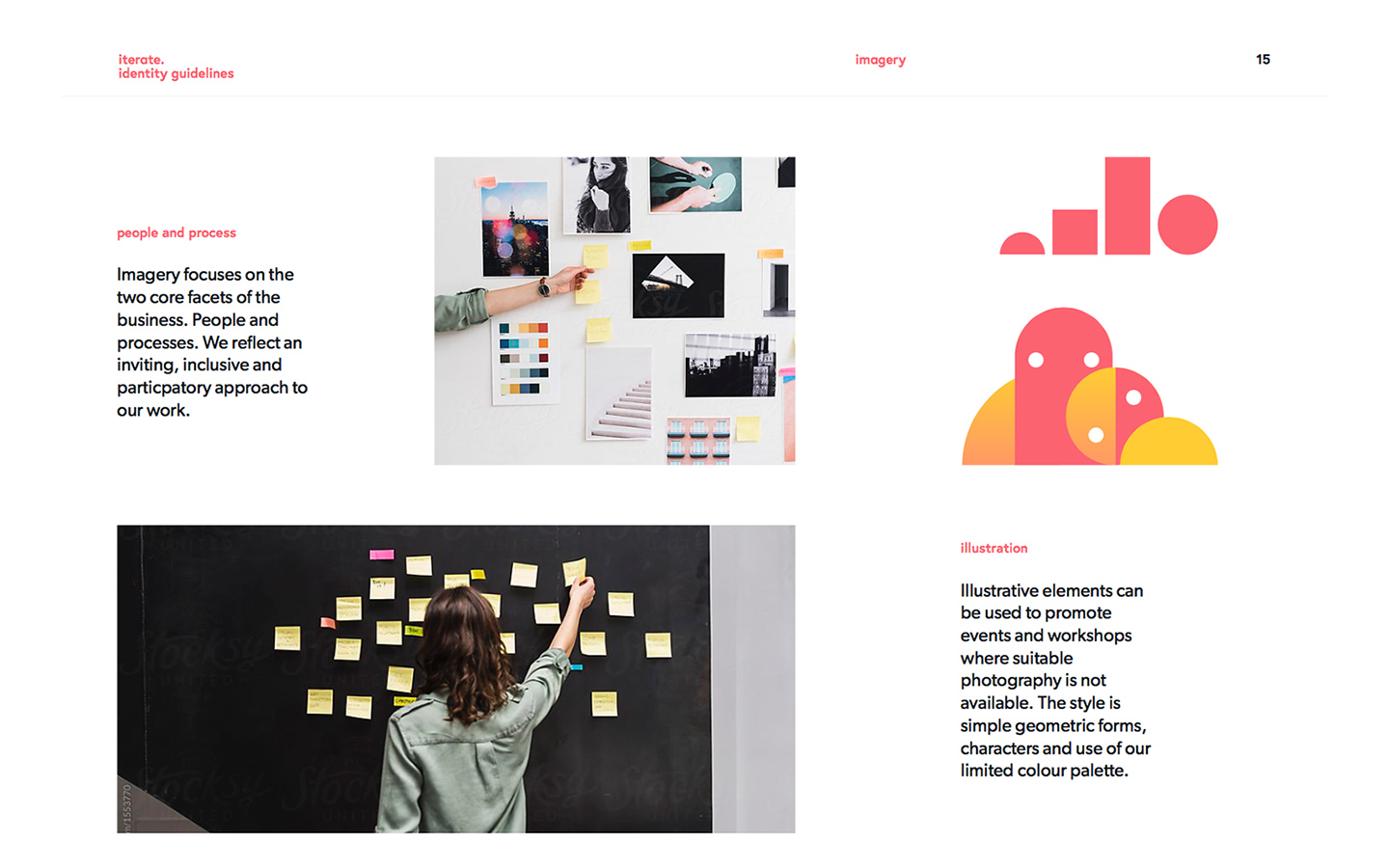
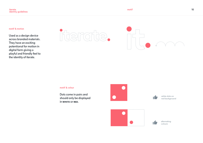
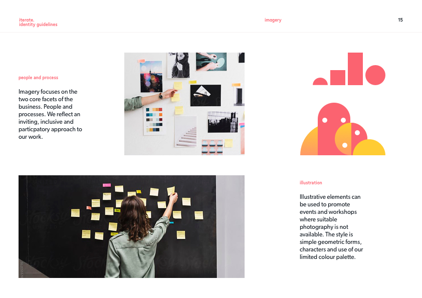
Motif
The colour dots in the wordmark presented an opportunity to use as a motif in branded materials. They could be used in a number of different ways to reinforce the brand.
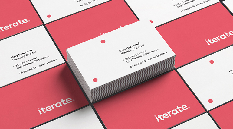
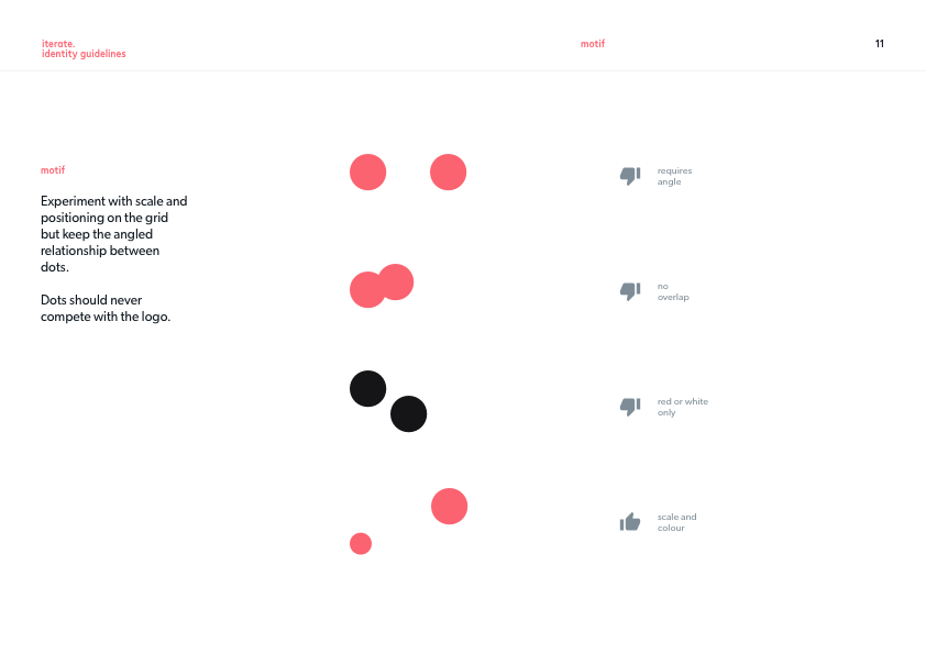
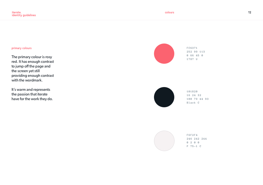
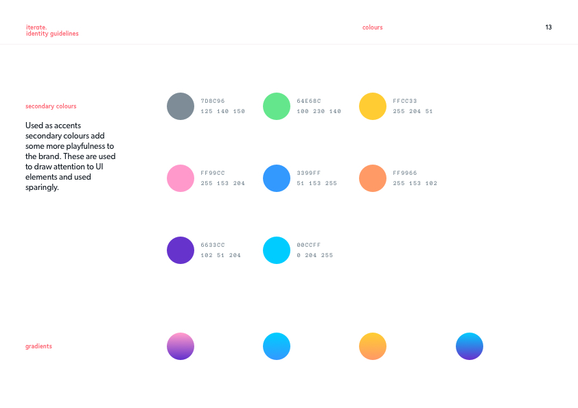
Identity Guidelines
Guidelines were created to give context to the visual identity and to demonstrate where the flexibility within the design system lay.

Selected Works
Responsive Web AppCase Study · 2020
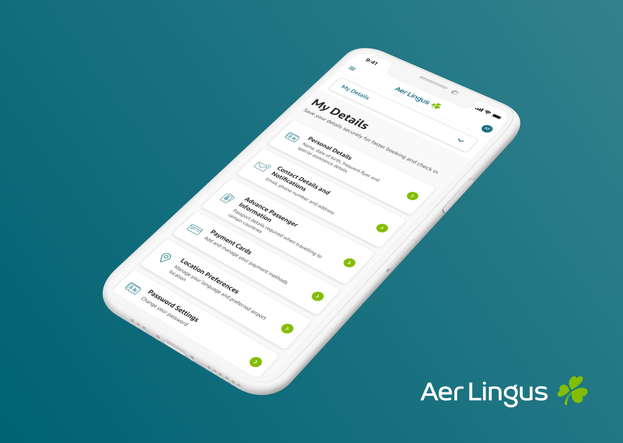
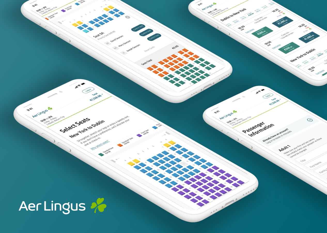
AerClub ProfileCase Study · 2020
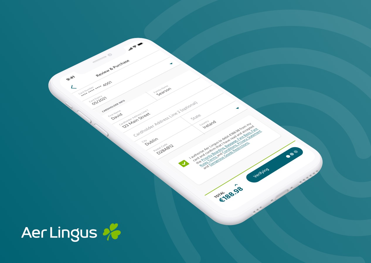
3D Secure PaymentsCase Study · 2019
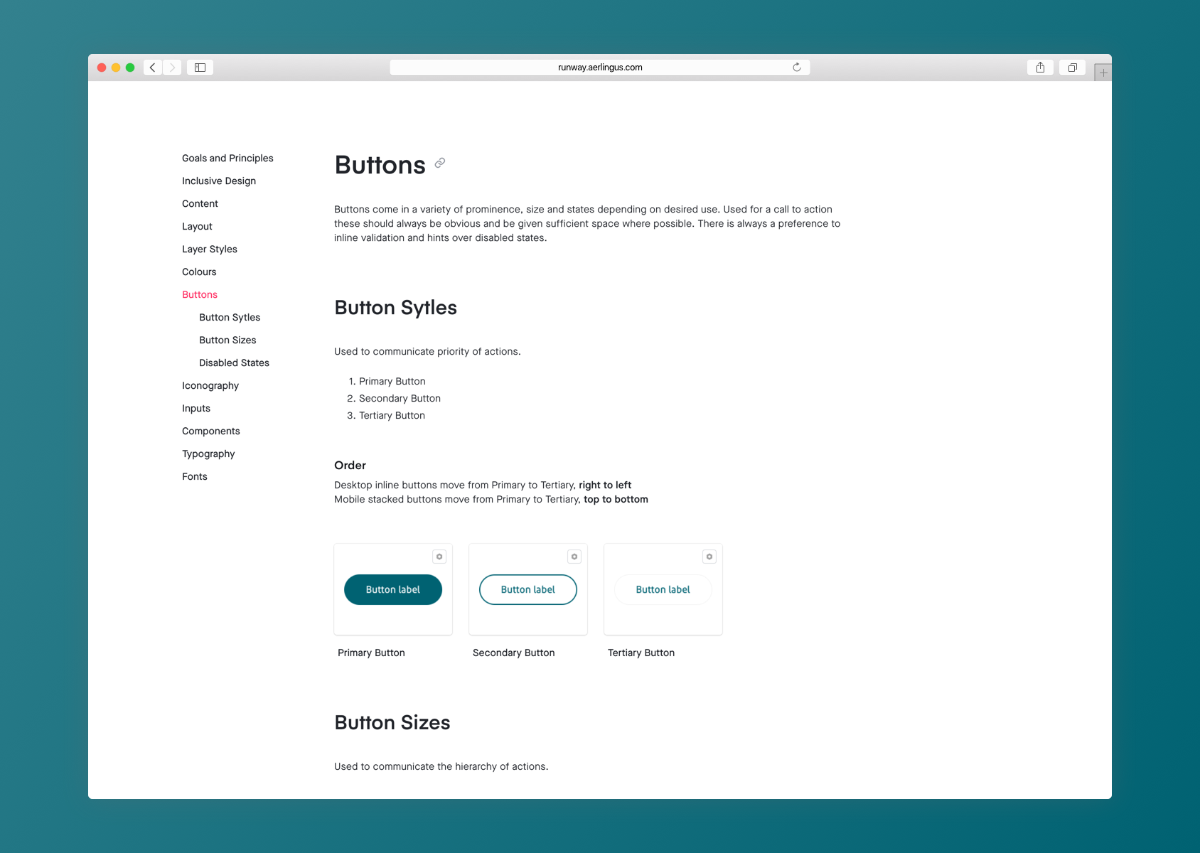
Runway Design SystemCase Study · 2019
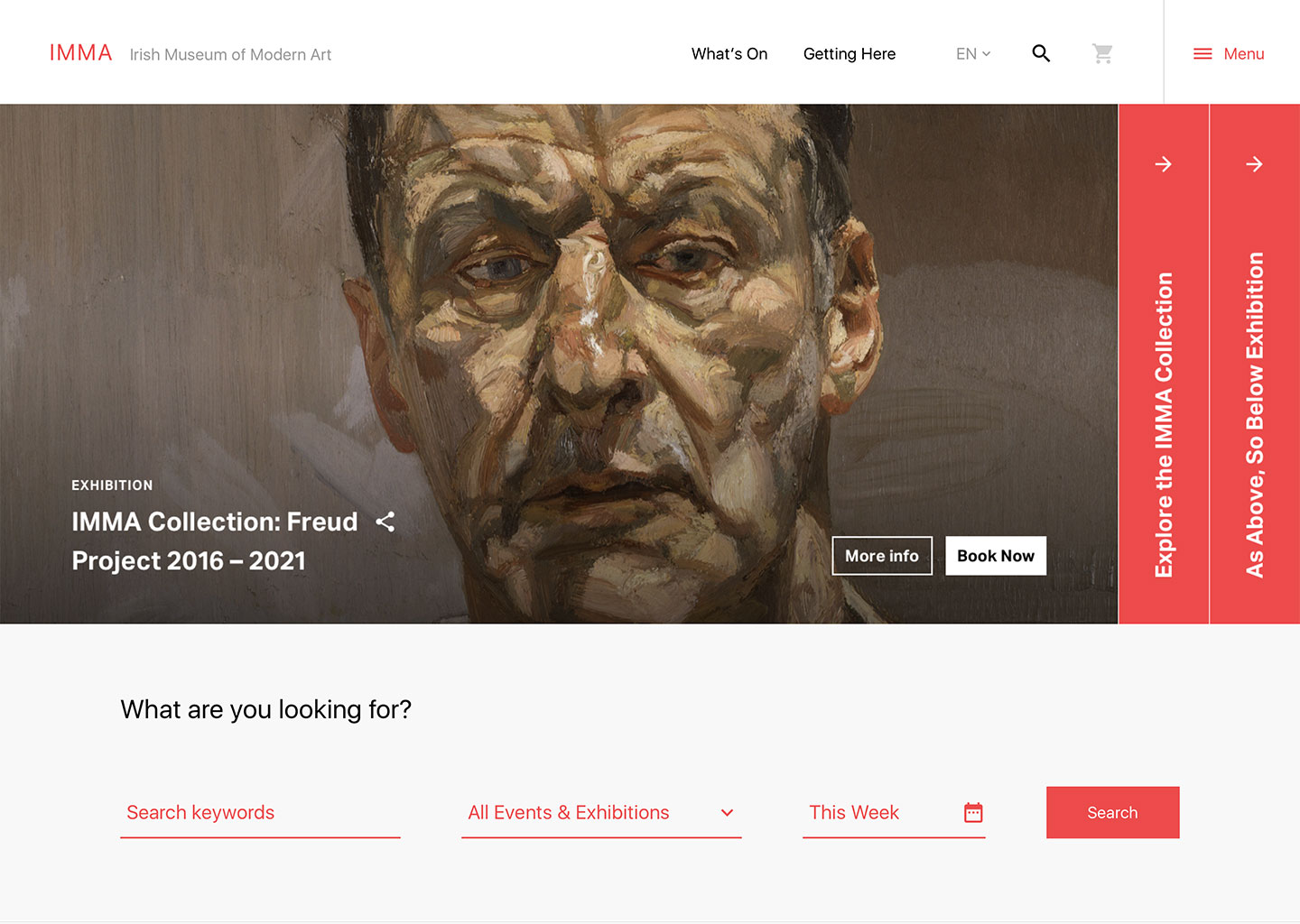
IMMA ConceptCase Study · 2017
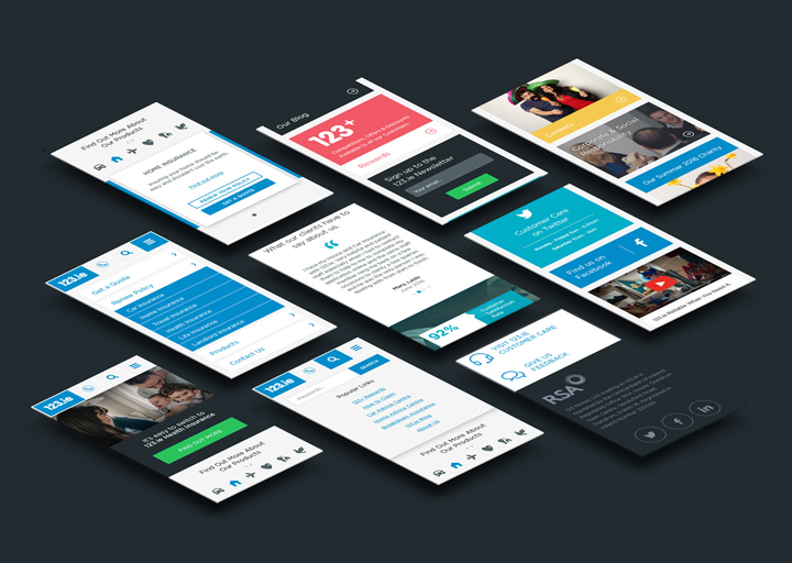
123.ieCase Study · 2016
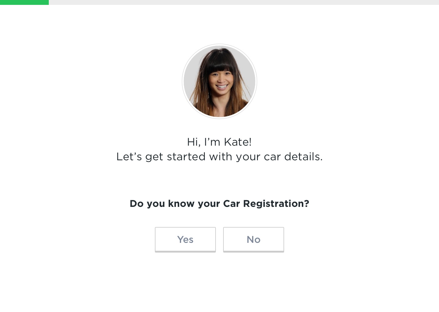
Motor Insurance Quote JourneyCase Study · 2016